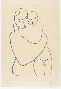
Henri Matisse (French, 1869–1954) Madonna and Child, ca. 1949–51, Lithograph, Promised Gift of Frank Raysor, L.139.2010.4
This is the third in a series of blog posts discussing highlights of the exhibition A Celebration of Print: 500 Years of Graphic Art from the Frank Raysor Collection currently on display in VMFA’s Mellon Focus Galleries. Admission to this exhibition is free.
One of the pleasures of A Celebration of Print is the wide range of style and subject matter. Each work of art in the exhibition, which covers 500 years, has the power to move the visitor, but some works are especially striking.
This is certainly the case with Henri Matisse’s Madonna and Child from around 1949-51. Connected to a series of studies for murals and decorations Matisse made for the Chapel of the Rosary in the French Riviera town of Vence http://www.ville-vence.fr/the-rosaire-chapel?lang=fr, Matisse transcended the historical subject of the Virgin and Child to create a timeless expression of a mother’s love. Though he was best known for his vivid use of color in his paintings, Matisse, with only a single exception, produced black-and-white prints throughout his career. In this radically simplified composition, Matisse has synthesized the forms to their most basic linear qualities.
To appreciate Matisse’s radicalism, it helps to look back at the comparison I made in previous blog posts between the early German Christ as the Man of Sorrows and Dürer’s Christ Crowned with Thorns Dürer’s innovation in that work consisted in using the engraver’s line to add volume and mass to his depiction of the suffering Christ. He thus eschewed the language of powerful simplicity of the early German work. Though it is doubtful Matisse had in mind early woodcuts when producing his lithograph, both works share a belief in the power of line to convey visual and emotional truth.
–Mitchell Merling, Paul Mellon Curator/Head of the Department of European Art